When I first got hired to work as a production artist at a print shop, there were already two other artists on-board and we were all using different design software. One of them was using a super outdated version of Corel Draw, the other was using Macromedia Freehand before Adobe bought them up, and here I was using Adobe Illustrator. Sharing files between Freehand and Illustrator wasn’t much of a hassle but trying to get a 5 year old version of Corel Draw to play nice and give us a file we could all use was monumental ass pain.
I knew everything about Illustrator and Photoshop (or I thought I did) but I knew nothing about creating graphics for screen printing. When I was being trained and someone said “okay make this a spot color” or “you need to add an underbase to this” I kind of just nodded my head and sweat beaded up on my forehead. Spot colo-wa-wah? An underwha?
I didn’t realize there were so many things I needed to know to specifically make graphics for screen printing. There was set up and print prep that needed to go into every design.
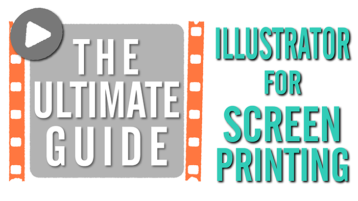
Why Illustrator is the best for screen printing graphics
While Photoshop and Corel Draw might be the favorite of most print shop art departments, I will forever stand by my opinion that Illustrator is the best and easiest design program for creating graphics for screen printing. The print flow is better for sending to RIP software, and your artwork is vector graphics so you can scale it up and down without pixelation. I also think it is second to only inDesign when it comes to creating type based artwork.
So this guide is not going to teach you the basics of Illustrator. I’m going to assume you already know how to use it for the most part. This guide contains all of the things I think are important to creating screen printing graphics in Illustrator.
I’ll tell you how to create a t-shirt mock-up and template, explain Pantone and spot colors, how to make typesetting special effects, how to create brushes and ink a sketch using a tablet, and finally how to create an underbase to go under your artwork for printing. I’ll also share some of my favorite little shortcuts and tricks along the way.
Part 1: Create a Template Mock-up, Registration Marks, and Spot Colors
In this first video, I’ll show you how to save time and create a template that you can use over and over and use to send mock ups to your customers for approval. I’ll describe how to create registration marks to go around your artwork and how to create a legend or key so your print shop will know what they’re printing. I’ll also talk about the basics of creating spot colors and what they are, and selecting Pantone colors from Illustrators color books.
Part 2: Create Awesome Typesetting for T-shirts Using the Appearance Panel and Warp Effects
Part 2 is all about typesetting. Simple typesetting is simple. A little too simple. Using the appearance panel with your type can help you achieve awesome effects and still leave your type dynamic and editable. The appearance panel is an often overlooked gem in Illustrator and I’ll show you just a fraction of what you can accomplish with it in this video.
I’ll also show you how you can add some warp effects to get really professional typesetting that stands on its own even with no other graphical elements.
Part 3: Create Brushes in Illustrator and Ink with a Tablet
For a program named Illustrator, there isn’t a lot of illustrating going on. When most designers want to ink or draw, they usually turn to Photoshop because of its in-depth brush tools. But I’ve always loved illustrating in Illustrator most because of its vector capabilities. Seriously whenever I show off my artwork and I tell people it was created in Illustrator, their number one question every time is how do you create a brush in Illustrator that is good for inking. And really, the brushes I create in Illustrator are super simple.
The next question I usually get is how I setup my drawing tablet to work with Illustrator. This is more a question of personal preference but I show you the settings I use everyday.Priligy Pills 30mg
Part 4: How to Create an Underbase
If you want to print artwork on colored garments, you need to print an underbase layer first and then print your artwork on top of it. Creating an underbase can be kind of tricky but this video will show you what an underbase is, and how to set up a choke and a trap on your artwork so that your underbase won’t show under your artwork.
Of course after all of this you’ll need to output your artwork to film which I cover here.
What Did I Miss?
So I think I covered a lot with these videos but let me know in the comments below if there is something you need help with and I will film it so hard. Creating graphics for screen printing can be a whole new beast even when you think you know everything about your graphics programs.
[wp_ad_camp_1]

Comments (3)
November 15, 2015 at 8:28 am
worth to spend time,
April 24, 2017 at 3:19 pm
This is very valuable. Thanks for sharing. This is a great place for me to start thinking in screen printing design versus design. Thanks again.
August 27, 2017 at 11:37 pm
Great post Casey!
Bruce, https://www.printavo.com